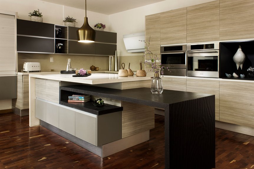
You can decorate your above-cabinet space with statement lighting fixtures, extended backsplash tile, and layered greenery. Try displaying artwork or collections as a gallery, use crown molding to define the area, and add warmth through live-edge wood or woven baskets. Paint the gap a bold contrasting color for visual interest, incorporate hidden storage, and keep clutter minimal for a polished look. Each approach works differently depending on your style, so the specifics matter.
Light Up the Space With Statement Fixtures

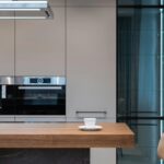
If you’ve got high ceilings in your kitchen, the space above your cabinets is prime real estate for adding visual interest—and lighting fixtures are one of the best ways to do it. I’d recommend installing spotlight sconces along your cabinet length. These create dramatic, high-contrast effects that draw your eye upward. Choose bold, inky, or metallic finishes for your fixtures so they stand out against your walls and cabinets. Position dedicated lighting to target specific areas like artwork or your desk. This strategic placement balances illumination without creating visual clutter. Pair statement fixtures with your above-cabinet decor thoughtfully. When your lighting style aligns with your overall kitchen design, you’ll achieve that polished, museum-like display you’re after. The fixtures themselves become focal points worth displaying.
Extend Backsplash Tile to Tie Everything Together

I’ve found that extending your backsplash tile all the way up to the ceiling creates a unified look that ties your cabinets, walls, and ceiling together into one connected design. When you carry the tile upward instead of stopping at the standard height, you’re eliminating visual breaks that can make a kitchen feel choppy and disconnected. This technique works whether you have a flat or vaulted ceiling, and it gives your kitchen a polished, built-in quality that appears deliberate and complete.
Seamless Visual Continuity
Why settle for a gap between your backsplash and ceiling when you can extend that tile all the way up above your upper cabinets? This approach creates visual continuity throughout your kitchen. Here’s what you’ll gain:
- Unified design: Your cabinetry, wall color, and ceiling lines work together as one cohesive feature
- Cleaner surfaces: You’ll eliminate those dust-collecting gaps that form between tiles and cabinet tops
- Expanded feeling: The continuous tile pattern makes your kitchen feel visually longer and more polished
When you extend backsplash tile upward, you’re not just decorating—you’re creating deliberate visual flow. Whether you choose neutral subway tiles or patterned options, this extension ties your whole space together. Your kitchen will look finished and well-considered, which also supports resale value by presenting a strong, unified feature wall.
Tile Extension Techniques
Extending your backsplash tile above the upper cabinets is one of the smartest ways to refresh your kitchen’s visual impact. When you carry tile all the way to the ceiling, you create a sense of continuity that makes your space feel larger and more deliberate. This technique keeps dust from settling on cabinet tops while giving your kitchen a polished, high-end appearance.
Here’s how to do it right: First, align your grout lines perfectly with your existing backsplash pattern. Second, choose tiles that are easy to wipe clean since they’ll be visible. Third, consider pairing the extension with above-cabinet lighting or artwork to maintain a cohesive color palette. This approach ties your entire kitchen design together, creating a feature wall that demonstrates careful planning and attention to detail.
Design Cohesion Benefits
How does carrying your backsplash tile all the way up to the ceiling affect your kitchen’s overall look? When you extend your backsplash tile upward, you’re creating visual harmony that ties your entire kitchen together. This approach offers real benefits:
- Visual expansion: Height draws the eye upward, making your space above your cabinets feel larger and more deliberate
- Unified design: Matching tile with your cabinetry eliminates awkward gaps and reinforces a cohesive aesthetic
- Practical advantage: A full-height backsplash reduces dust collection on horizontal surfaces
This technique works especially well when you’re displaying bold decor above your cabinets. The calm backdrop lets artwork, mirrors, or lighting accents shine without competing for attention. You’ll achieve that stately, French country-inspired look while strengthening the architectural lines throughout your kitchen. It’s a straightforward way to improve your entire design.
Layer Houseplants for Instant Greenery and Height

One of the easiest ways to address that shadowy gap above your kitchen cabinets is by stacking houseplants at varying heights. I’d recommend using trailing or cascading plants like pothos or string of pearls—they draw your eye upward without creating clutter. Layer your plants at different levels to create visual interest and fill that empty space with vibrant green hues.
For low-maintenance options, consider faux plants. They require no watering and designers like Gina Sims favor them for their practicality. Select planters that match your kitchen’s style—ceramic, wicker, or metal work well. Align your plant choices with your existing cabinetry and backsplash textures. This layering technique brightens dim areas while maintaining design cohesion throughout your kitchen.
Showcase Collections and Artwork as a Gallery

If plants aren’t your style, you can turn that space above your cabinets into a personal gallery that tells your story.
I like to arrange artwork and collections strategically to create visual interest. Here’s what I do:
- Display oversized artwork or bold objects that anchor the space and reflect where you’re from or what you love
- Arrange items at varied heights in evenly spaced groupings so nothing feels cluttered or boring
- Add LED strip lighting underneath to highlight your pieces and improve how they look
Choose colors and materials that match your kitchen. I stick with whites, neutrals, or metallics so my artwork becomes the real focus. This approach turns that empty space into something that’s genuinely yours while keeping everything organized and visually balanced.
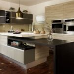
Anchor the Space With Crown Molding or Faux Beams

Crown molding and faux beams anchor your kitchen by creating visual structure above the cabinets, turning blank space into a deliberate architectural feature that draws the eye upward. You’ll want to match your molding or beam finish to your flooring or cabinet wood tone—this creates a unified look that ties your entire kitchen together rather than making the top of the space feel disconnected. Whether you choose rustic wood molding or oversized dentil details, these elements give your kitchen definition and help balance the visual weight between your cabinetry and ceiling.
Visual Structure and Definition
How do you turn that awkward gap above your kitchen cabinets into something that actually looks intentional? Crown molding and faux beams create the visual structure your space needs. Here’s what works:
- Crown molding frames your cabinets — It acts like a picture frame that draws your eye upward and makes the whole kitchen feel more polished and complete.
- Faux beams add architectural interest — They establish vertical lines that emphasize height and give your kitchen actual dimension, especially in flat ceiling spaces.
- Wood tones unify your design — Matching your trim to your floor or cabinet finishes ties everything together cohesively.
The key is balancing these elements with your existing cabinetry and lighting. You don’t want your crown molding or beams overpowering the room. Done right, they turn that empty gap into a defined, purposeful detail that makes your kitchen feel complete.
Material Selection and Finishes
What you choose to frame that gap above your cabinets matters just as much as the structure itself. Crown molding acts as a visual anchor, connecting your upper cabinetry to the ceiling while defining the space with intention. You can select warm wood trim to soften a black-and-white palette, or choose bold, contrasting finishes like inky or metallic tones to emphasize the gap as a deliberate design feature. Oversized dentil crown molding turns empty space into a refined focal point with stately appeal. Your trim choice should coordinate with other kitchen elements—floors, hardware, and cabinetry—to maintain consistent aesthetics throughout the room. This thoughtful selection turns a potential eyesore into an architectural strength.
Design Cohesion With Surroundings
Once you’ve settled on your trim material, coordinate that choice with the rest of your kitchen’s architecture. Crown molding creates visual cohesion by tying your above-cabinet space to the broader design. Here’s how to anchor everything together:
- Match your crown molding finish to your cabinetry, flooring, or hardware for a unified appearance
- Choose complementary tones that reduce visual noise and strengthen the overall aesthetic
- Install the molding at a consistent height to emphasize the cabinetry line and create intentional sightlines
This deliberate approach makes your kitchen feel intentionally designed rather than random. When your trim coordinates with surrounding elements, the entire space flows together. You’re framing the top of your cabinets, which adds a finished quality to the room.
Bounce Light and Expand the Room With Mirrors

Why not tap into one of the simplest tricks for brightening your kitchen? Mirrors above cabinets reflect natural light and expand perceived space without adding clutter. Position your mirrors to align with cabinet lines for a unified appearance. Choose one finish—brass, chrome, or bronze—that matches your kitchen’s style.
| Mirror Type | Best For | Installation | Maintenance |
|---|---|---|---|
| Frameless | Modern kitchens | Wall-mounted brackets | Weekly wiping |
| Framed brass | Transitional spaces | Adhesive strips | Monthly cleaning |
| Beveled edge | Traditional kitchens | Heavy-duty hooks | Dust removal |
| Bronze-finished | Contemporary design | Stud mounting | Grease wipe-down |
Pair mirrors with under-cabinet or pendant lighting to maximize their reflective effect. Secure your mirrors firmly since cooking zones create dust and grease buildup. Regular cleaning keeps reflections sharp and your kitchen bright.
Choose Live-Edge Wood, Woven Baskets, or Warm Tones

While mirrors bounce light around your kitchen, you’ll also want to add texture and warmth to the space above your cabinets. The right materials create a balanced, inviting look.
Consider these options:
- Live-edge wood bowls bring organic warmth and natural beauty, especially in neutral kitchens where they soften stark white palettes
- Woven baskets offer practical storage while adding texture; whitewashed versions brighten the area and complement high ceilings
- Warm-toned trim or crown molding bridges white cabinets and ceilings, preventing a cold black-and-white feel
Combining wood, baskets, and warm textiles creates the thermal and tactile variety your space needs. This mix prevents the area from looking flat and disconnected. You’re building layers that work well with your kitchen’s existing materials and finishes.
Paint the Gap a Contrasting Hue for Drama

I recommend treating that gap above your cabinets as a design feature, not a mistake, by selecting a bold color that contrasts with your cabinet finish and walls. You’ll want to consider how your chosen hue—whether it’s a deep navy, charcoal, or even a rich jewel tone—plays with your wall color and any ceiling treatment to keep the space feeling balanced rather than chaotic. This approach guides your eye upward and creates architectural interest that adds dimension to your storage area as a deliberate design choice.
Bold Color Selection Strategy
If you’re ready to work with that gap above your cabinets as a design feature, painting it a bold, contrasting color is an effective option. Your bold gap color should stand out against your existing walls and cabinets to create visual impact.
Here’s how to select your color:
- Choose a shade that contrasts sharply with your cabinet and wall finishes for drama
- Consider matching your bold gap color to your ceiling or other cabinet tones for cohesion
- Test samples in your actual kitchen lighting before committing
This approach treats the gap as intentional architecture rather than a mistake. When you pair your bold gap color with overhead lighting or metallic accents, you’re increasing contrast and drawing eyes upward. The result appears planned and deliberate.
Creating Visual Architectural Interest
Painting that gap above your cabinets a bold, contrasting color shifts it from overlooked space into a deliberate design feature that draws the eye upward. I recommend selecting a hue that contrasts sharply with your cabinet color—try deep navy, charcoal, or forest green against light cabinetry.
This technique works best when you tie the space above the cabinets into your overall palette. Match it to your ceiling, backsplash, or wall tones for visual harmony. The contrast emphasizes architectural lines and reinforces verticality without creating clutter.
Balance matters. Keep surrounding surfaces cohesive so the bold gap reads as purposeful rather than random. This approach adds drama and sophistication to your kitchen while maintaining a unified, carefully composed appearance that registers as both modern and polished.
Complementary Palette Coordination Techniques
How do you make that forgotten space above your cabinets work harder visually? Paint the gap between your cabinets and ceiling to create contrast while maintaining design purpose.
Start by choosing a bold color that works with your kitchen palette. Consider:
- Inky or metallic finishes that stand out against your wall and cabinet tones
- Color alignment with your room’s existing scheme—whites, grays, or blacks pair well
- Strategic pairing with adjacent surfaces to avoid visual clutter
This high-contrast gap becomes an anchor for your above-cabinet styling. Once you’ve painted it, you can place artwork or lighting with confidence. The gap informs your design choices, making your kitchen feel organized rather than scattered. That’s how intentional above-cabinet decor comes together.
Hide Storage in Your Above-Cabinet Decor
You can keep practical items hidden above your cabinets while maintaining a polished appearance. Use decorative doors, pull-down doors, or curtains to conceal storage baskets and boxes. This approach lets you access items easily without displaying clutter.
Match materials and finishes to your cabinetry. Inky or moody backdrops help blend hidden storage into your kitchen’s overall design. Select storage baskets with uniform shapes and colors, then label them clearly for quick identification.
Keep items minimal and opt for washable, dishwasher-safe pieces to reduce cleaning effort. This strategy provides functional overhead storage that looks organized and maintains your kitchen’s consistent aesthetic without visual chaos.
Minimize Clutter While Decorating Above Cabinets

The key to keeping above-cabinet space from looking cluttered? Strategic restraint and intentional grouping. Restraint works best when you’re decorating this tricky area.
Here’s what actually works:
- Group in odd numbers. Arrange three or five items together rather than scattering pieces across the entire top. This creates visual unity instead of chaos.
- Choose uniform containers. Use matching baskets or decorative bins for storage. They blend harmoniously while keeping seasonal items hidden and organized.
- Add breathing room. Leave negative space between groupings. This prevents the area from feeling crowded or top-heavy.
Above-cabinet decor succeeds when you’re selective. Stick to a cohesive color palette matching your cabinetry and avoid cramming in every decorative item you own. Your kitchen will feel organized and calm.